Five ways to make your Substack look more professional
Fantastic content is everywhere on Substack.

Fantastic content is everywhere on Substack. Every day I have the pleasure of reading something different, be that someone with 10 subscribers or 10,000.
But how can you make your newsletter stand out among the many that already exist? And how can you ensure that it looks professional, so prospective new readers will want to subscribe and keep coming back for more?
Let’s take a look.
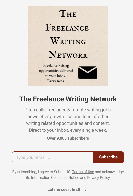
The welcome page
This is the very first thing that people see when they click on your Substack page, before they see any articles or content.
You can edit your welcome page by navigating to your publication settings, with it possible to alter these details within the ‘Website’ section.
There, you can add a welcome page photo (which you want to be relevant to your page, an image of some sort) and add the short description for your page, something you might have already written (and found in the ‘Basics’ section in your settings).
Ensuring this looks professional is so important for encouraging prospective readers to click through and see your work. How do they know what to expect? Can you tell them exactly what they’re going to read with an image and a couple of sentences?
You want to encourage new readers that this is a worthwhile place for them to return to, and ensuring they are immediately met with a professional looking website is really important for that. Seeing that a writer has taken the time to refine this can go a long way for a new reader.
The ‘About’ section
I am often surprised about the length of the ‘About’ section on many Substack newsletters. It’s very common for writers to leave this as the default text, and therefore this tells me nothing about what I might read.
Plus, if any of the writing is behind a paywall, how am I supposed to know what I might read by subscribing? Or even what I might read by paying to upgrade?
You don’t need to write paragraphs and paragraphs of information—though I have seen this done well. Even if your Substack is just a personal blog or something simple for you to enjoy, even a paragraph or two explaining the content is helpful.
If you do paywall your writing, this is also a great opportunity to include information about what paying subscribers get, and potentially a free trial or discount code. I’ve certainly been able to utilise this in the past!
If you want to see good examples of effective ‘About’ pages, I’d recommend checking out this one by Auraist for a section with great detail and information, and this one by Newsletter Circle for a clear and straightforward description about what free and paid subscribers get by subscribing.
Branding
I actually made my Substack logo and ‘branding’ on Canva and it took me about five minutes. I actually really love how authentic it feels now, and though I’ve considered a redesign, it’s never felt right.
But this branding, whatever you think about it, has helped create a sense of professionalism. It’s on many of my posts, it’s my profile picture, it’s my default image for social media—it’s everywhere that the Freelance Writing Network is.
Branding doesn’t need to be complicated. I do not have any graphic design skills (unless you like grainy images from Microsoft Paint) and even I managed to make one without too much trouble!
Have a look at other publications for inspiration. Many of them just incorporate their publication title into a stylish font/design and leave it at that. This isn’t something you have to create and then stick with for the rest of your life, but if you’re just getting started then this makes your newsletter look more professional.
And it doesn’t just have to be your publication logo. Your welcome page photo, watermarks, email headers and footers—all of this is branding. I’d suggest putting something in place so that your branding is consistent across your newsletter, be that on the different pages online or through your emails.
Website layout
I have seen some great website layouts over my last 12 months on Substack.
If you want to change yours, head to the ‘Website’ section of your publication settings or ‘Branding’ followed by ‘Publication theme’.
I have very little advice for this one other than to check how it currently looks and have a play around. But how much more professional does the image below look than simply a collection of blog posts? Even if you aren’t running a professional website, there is no reason your Substack can’t look the part.
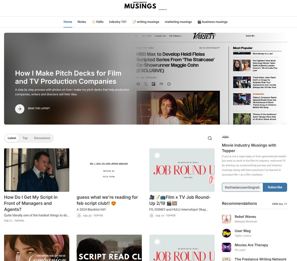
You can play around with colours, links, design, branding, format and more. It’s actually possible to just create your own website and it’s so simple. You can even modify how it looks on a computer vs how it appears on a phone.
I find that this makes a big difference to me when finding new newsletters because this level of professionalism really demonstrates how much the writer cares about their work. It’s not necessary, but it certainly helps.
Welcome emails
This is something so simple and so effective that every good Substack newsletter utilises.
Someone takes the time out to read your post. Perhaps they’ve found you via Notes. They decide to subscribe to your Substack and what is it that greets them? The default new subscriber email because the writer hasn’t even realised they exist.
Welcome emails are so important for making a good first impression. This is the first a new reader sees of you, remember!
I use my welcome emails to explain what a new subscriber can expect, what they get from upgrading to paid and I also include a free trial link too (though worth mentioning that while I use free trials regularly—I appreciate they don’t work for everyone).
Just doing this allows a new reader to get to know you a little, to see the format and style of your writing. It’s important because when that first post hits their inbox, you want them to instinctively know what to expect.
A strong welcome email, while it can still be short and sweet, helps set expectations and allows new readers to remember what they might expect ahead of future posts or emails.
If your newsletter name doesn’t immediately tell a reader what the content is about then I’d suggest this is even more important. The last thing you want someone to do is forget!
Any questions?
If you need help with accessing any of these settings or would like advice from me on how your publication looks, please remember you can message me, use the FWN chat at any time or just leave a comment and I’ll get back to you soon!